Author Kel Bruem
Kel Bruem is a romantasy author who needed a website redesign that could hold news about the author's events as well as a user-friendly collection of her books available for purchase.
An important aspect of this project was allowing Bruem to update the website easily for either her or anyone on her team without any technical expertise. This required an easy-to-use admin interface that was custom built for Bruem, allowing her to add products and news entries on the fly. With a simple content management system created specifically for Bruem, we were able to upgrade her from a standard collection of links without overengineering a back-end or installing complicated software with features the client wouldn't use.
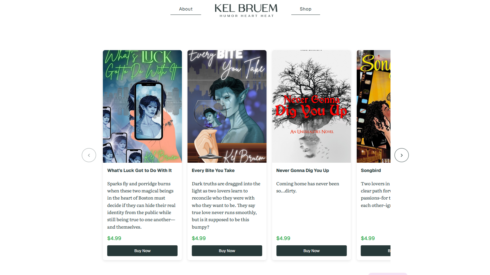
The homepage features an easy carousel of available novels with purchase options accessible right away to the user.